The goal of this project was to design a logo for a fictitious company, called Sew & Tell. I did a lot of experimentation and brainstorming (shown below) to arrive at these two final designs.
Step 1: Sketches
Step 2: Digital Concepts
Step 3: Refinements
Step 4: Final Designs
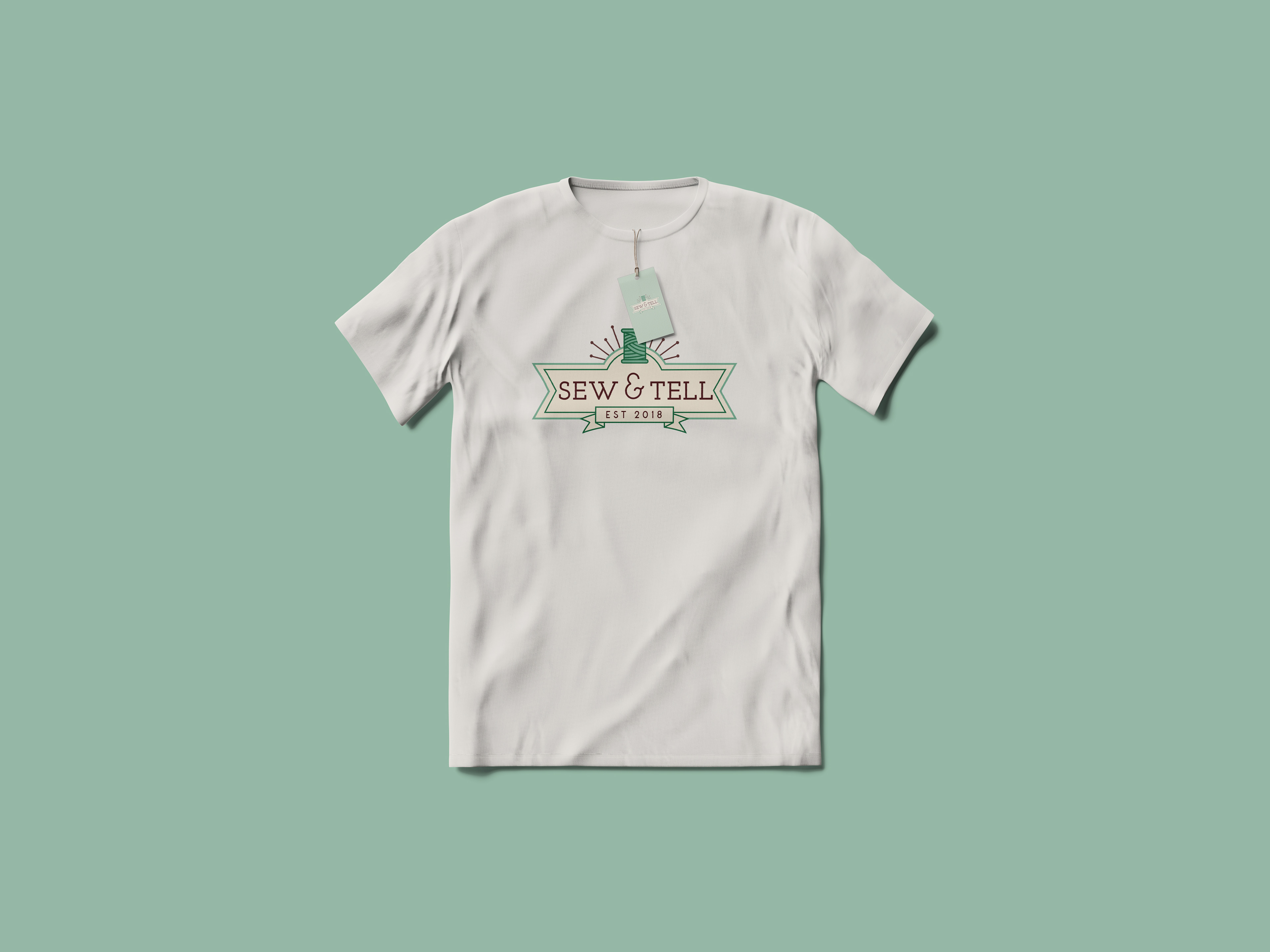
The concept for this logo design drew inspiration from vintage beer labels, barber shop sign-age and boyscout badges. I liked the relationship between symbols and typography, while maintaining simplicity yet having just enough detail. The spool of string and pins have a recognizable sewing association, while the banner treatment can also represent ribbon.
The color palette includes two shades of green, cream, and dark brown. This combination gives off a vintage, Victorian era aesthetic while maintaining a modern feel with the slab serif typeface and sans-serif secondary typeface.
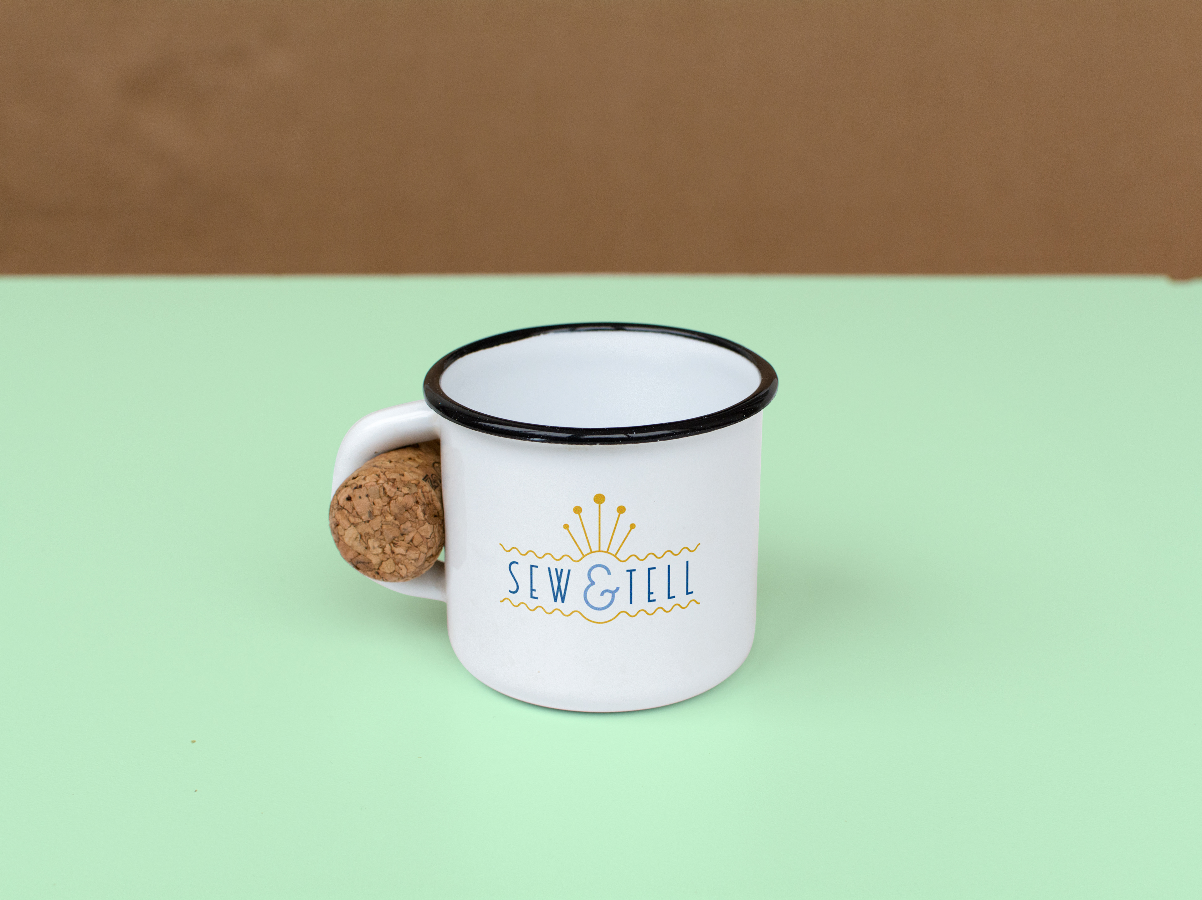
The concept for this logo design originated from Art Deco illustrative elements. I was drawn to the bold lines and shapes. During my initial sketching phase, I experimented with common sewing objects in a way that could be ambiguous, yet subtly recognizable. The “pins” sticking out on top of the logo are paired with a wavy line that could be translated as ribbon or a sewing guide.
The color palette includes a bold shade of blue and gold, with an accent shade of lighter blue. I thought this represented a somewhat gentle aesthetic that complimented the more sharp letter forms
and soft, rounded ampersand.
and soft, rounded ampersand.
